The image macro
Typically set in capitals in the Impact typeface
Biggest memes ever6 of 32
2007·Early YouTube·informative
A picture with text laid over it, usually a line at the top and a line at the bottom.
At a glanceThe facts
- Spread in
- 2007
- Format
- Meme
- Where it started
- The term was coined on the Something Awful forums, where a “macro” was a short piece of text the software expanded into a stock image
- What it said
- Typically set in capitals in the Impact typeface
- Origin
- No single original
- Available
- Not held by ViralWorld
What this wasThe story
A picture with words laid over it — traditionally one line at the top and one at the bottom, in white Impact with a heavy black stroke so that it stays legible over anything. The type choice is not an aesthetic decision: Impact was the condensed bold face shipped with Windows, so it was the one everybody had.
The macro was displaced by screenshot-and-caption formats, then by short video, and the Impact convention now reads as deliberately dated — used ironically, or by people whose first internet was the 2010s. It remains the most widely reproduced visual convention the internet has produced.
Why it matteredWhat changed
Among the most common forms of internet meme in the 2000s: a picture, white capitals with a black edge, a set-up above and the point below.
What people misrememberSet straight
Commonly remembered asRage comics are image macros.
ActuallyThey are not, though single rage faces are often made into them.1
Commonly remembered asIt has to be in Impact.
ActuallyThat is only the usual typeface.1
What it createdWhat came out of it
- Lolcats are considered the first notable image macros, and the snowy owl saying “O RLY” the classic example.1
- Advice animals and stock characters such as Bad Luck Brian and Success Kid use the same form.1
- A variant of this O RLY?Meme · 2003
The snowy owl captioned O RLY is given as the classic example of an image macro.
- A variant of this LolcatMeme · 2007
A lolcat is an image macro with a cat in it: a photograph under a caption in heavy capitals, in the dialect the format made famous.
- A variant of this Success KidMeme · 2011
Named as one of the stock characters the image macro form is used with.
- A variant of this Bad Luck BrianMeme · 2012
Named as one of the stock characters the image macro form is used with.
More from hereIn this collection



Why it is here: something the internet still knows by name · a moment that changed what the internet did next · copied, redrawn and reused until the original stopped mattering · it got out of its own corner of the internet fast
Where it came fromWhat we know
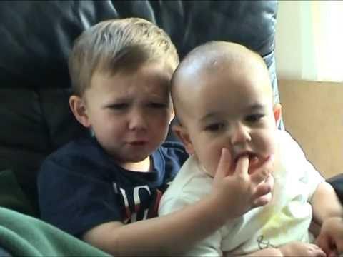
This spread through many posts rather than one identifiable original. The example shown is one surviving copy and is not claimed as the first.
Nothing here is claimed to be the first version of this. It spread through many posts rather than from one identifiable original.
Not established. This index only names a creator where the evidence supports it.
What this was built on, each one a record of its own.
- Taken from Something AwfulPhenomenon · 2001
The term was coined on the Something Awful forums, where a macro was a short text entry that expanded into a stock image.
More from 2007You were there





SourcesWhat was read
Sources last read on . That date is about the history on this page. Whether the media still plays is checked separately and can change any day. How ViralWorld documents things